Tie-dye is all about unleashing your creativity through color, but choosing the right combinations can make or break your design.1 The secret to a successful tie-dye project lies in understanding how colors interact and blending them harmoniously for eye-catching results.
Fun tie-dye color combinations often involve complementary, analogous, or monochromatic schemes that enhance vibrancy and add depth to your designs.
Let’s dive into some exciting color ideas and tips for creating stunning tie-dye patterns.
What colors to put next to each other in tie-dye?
The placement of colors in tie-dye is crucial because they can blend to create beautiful new shades—or muddy hues if they clash.
When choosing colors for tie-dye, place complementary or analogous colors next to each other to create smooth transitions and avoid undesirable mixing.
Learn how to select the best colors for your tie-dye projects.1
1. Complementary Colors
Complementary colors sit opposite each other on the color wheel, creating a bold, vibrant contrast when paired.
Examples:
- Red and green
- Blue and orange
- Yellow and purple
| Pros | Cons |
|---|---|
| High contrast and vibrant designs | May create brown tones if overly blended |
2. Analogous Colors
Analogous colors are next to each other on the color wheel, offering a cohesive and harmonious look.
Examples:
- Blue, teal, and green
- Orange, red, and yellow
- Purple, pink, and magenta
| Pros | Cons |
|---|---|
| Smooth blending with no harsh edges | Less bold compared to complementary schemes |
3. Monochromatic Shades
Monochromatic tie-dye focuses on varying shades of a single color, offering subtle yet striking results.
Examples:
- Light to dark blue
- Pastel to deep pink
- Gradient shades of gray
| Pros | Cons |
|---|---|
| Elegant and easy to coordinate | Lacks the excitement of multi-color schemes |
Tips for Placing Colors
- Avoid Clashing Colors: Colors like red and green, if mixed too much, can create brown tones.
- Blend Purposefully: Use white space or intentional overlaps to control how colors mix.
- Experiment with Gradients: Gradual shifts between colors, like yellow to orange to red, create dynamic designs.

Best Tie-Dye Color Combinations to Try
Certain color combinations are classic in tie-dye and consistently deliver stunning results. Explore beginner-friendly options here.2
1. Rainbow Explosion
A timeless tie-dye choice, the rainbow pattern is perfect for creating vibrant, cheerful designs.
Colors: Red, orange, yellow, green, blue, and purple
- Arrange in a spiral pattern for a classic rainbow swirl.
- Ensure smooth transitions between colors to avoid muddy tones.
2. Ocean Breeze
Capture the essence of the sea with cool, calming colors.
Colors: Turquoise, teal, navy blue, and white
- Ideal for wave-like or crumple patterns.
- Add extra white space for a fresh, airy look.
3. Sunset Glow
Recreate the warmth of a sunset with fiery shades.
Colors: Yellow, orange, red, and pink
- Use a bullseye technique for a glowing, sun-like effect.
- Blend the edges between colors for a smooth transition.
4. Pastel Dream
Soft and understated, pastel tie-dye is perfect for a chic, modern aesthetic.
Colors: Lavender, mint green, baby blue, and blush pink
- Use diluted dyes to achieve soft hues.
- Combine with a scrunch pattern for a dreamy, marble effect.
5. Neon Pop
Make your designs stand out with bold, bright neon colors.
Colors: Neon yellow, hot pink, lime green, and electric blue
- Works best with geometric or stripe patterns.
- Pair with black for a striking contrast.
6. Earthy Tones
For a grounded, bohemian vibe, go for natural, earthy colors.
Colors: Olive green, rust orange, tan, and brown
- Great for shibori or tie-dye folds.
- Pair with off-white or cream for a sophisticated finish.
How to Make Your Tie-Dye Colors Pop
Achieving vibrant, long-lasting colors requires more than just picking the right hues. Learn how to enhance tie-dye vibrancy here.3
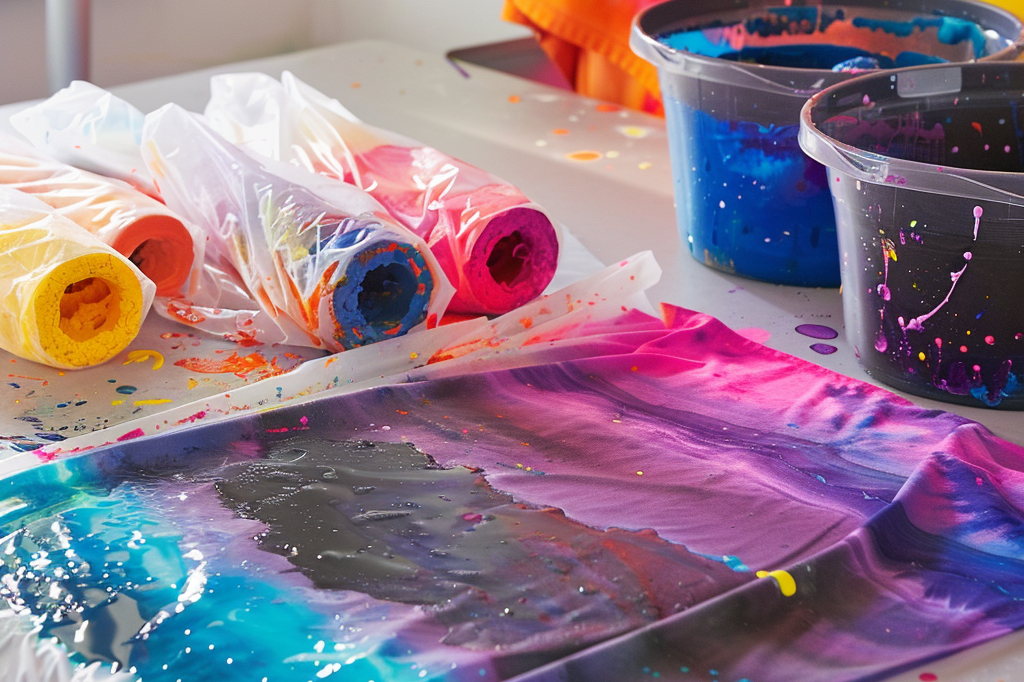
1. Pre-Treat the Fabric
- Use a soda ash solution to prep the shirt before dyeing.4 This helps the dye bond better to the fibers, resulting in more vibrant colors.
2. Use High-Quality Dyes
- Fiber-reactive dyes are ideal for tie-dye projects as they produce brighter colors that won’t fade over time.
3. Control the Setting Process
- Keep the dyed shirt damp and let it set for 6–24 hours. The longer it sets, the more vibrant the results.
4. Rinse with Care
- Rinse the shirt in cold water first to lock in the color, then wash with mild detergent.
5. Layer Colors Strategically
- Apply lighter colors like yellow first, then add darker shades like blue or red. This prevents dark colors from overpowering lighter ones.
Mistakes to Avoid with Tie-Dye Color Combinations
Even experienced tie-dye enthusiasts can run into issues. Here’s how to avoid common tie-dye mistakes.5
-
Over-Mixing Colors
- Avoid placing too many contrasting colors side by side, as they may blend into muddy shades.
-
Skipping Fabric Preparation
- Failing to pre-wash or pre-treat the fabric can result in uneven dye absorption.
-
Using Too Much Dye
- Oversaturating the fabric can lead to color bleeding and loss of defined patterns.
-
Rushing the Process
- Allow ample time for the dye to set. Rushing to rinse can dull the colors.

Conclusion
Tie-dyeing is an art form that thrives on bold, creative color choices. From classic rainbows to soothing pastels and earthy tones, the possibilities are endless. By understanding color placement, experimenting with fun combinations, and applying best practices,2 you can create vibrant, personalized designs every time. Let your imagination guide you and bring your colorful ideas to life!
Footnotes
-
Provides guidance on selecting color schemes and understanding color blending. ↩ ↩
-
Suggests beginner-friendly combinations and patterns for easy success. ↩ ↩
-
Offers tips on enhancing the vibrancy of tie-dye projects. ↩
-
Explains the benefits of pre-treating fabric with soda ash for better dye results. ↩
-
Highlights errors to avoid when applying multiple colors in tie-dye designs. ↩