Skip to content
Using Design Principles to Create Eye-Catching Clothing Collections
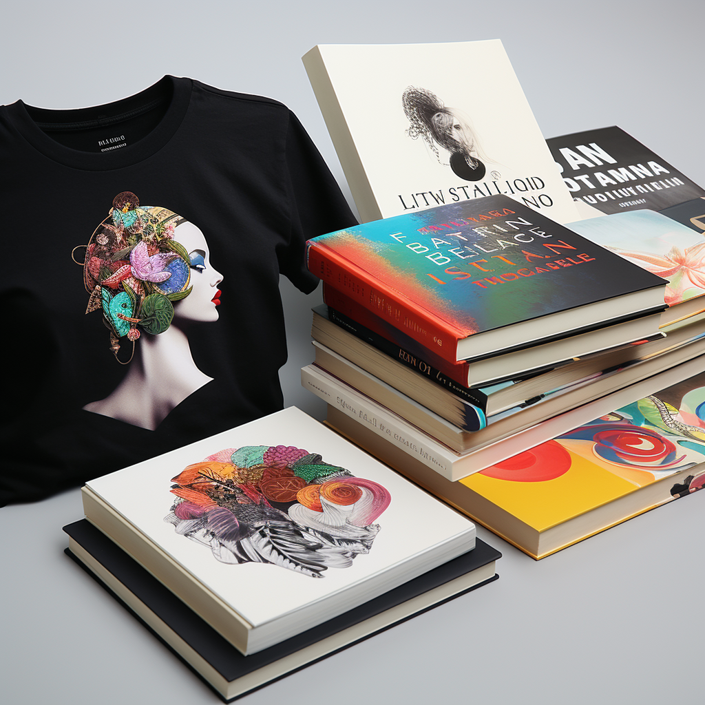
Are you ready to unleash the power of color and create clothing collections that turn heads? Look no further! In this article, we delve into the world of design principles and how they can be used to create eye-catching clothing collections. From understanding the psychology of color to mastering the art of color combinations, we will guide you through the process of creating visually stunning garments that captivate your audience.

Color is a universal language that speaks to our emotions and influences our decisions. By strategically incorporating different hues, shades, and tones, you can create a strong brand identity and convey specific messages through your clothing collections. Whether you want to evoke feelings of excitement, tranquility, or confidence, understanding the power of color is essential.
In addition to color, we will also explore other design principles such as balance, proportion, and texture, and how they contribute to the overall visual impact of your collections. By implementing these principles effectively, you can breathe life into your designs and create garments that not only look remarkable but also reflect your brand’s unique voice.
Get ready to explore the world of design and unlock the potential of color. Let’s make your clothing collections shine!
Understanding color theory and its impact on clothing collections
Color is a universal language that speaks to our emotions and influences our decisions. It has the power to evoke certain moods, convey specific messages, and create a lasting impression. By understanding the fundamentals of color theory, you can harness this power and create clothing collections that resonate with your target audience.
Color theory is the study of how colors interact with each other and how they can be used to communicate different emotions and meanings. It encompasses concepts such as hue, saturation, value, and color harmony. By familiarizing yourself with these principles, you can make informed decisions when choosing colors for your clothing collections.

One important aspect of color theory is the color wheel. The color wheel consists of primary, secondary, and tertiary colors, arranged in a circular format. By understanding the relationships between these colors, you can create harmonious and visually appealing color schemes for your clothing collections.
When selecting colors for your clothing collections, consider the emotions and messages you want to convey. For example, warm colors like red, orange, and yellow are often associated with energy, passion, and excitement. On the other hand, cool colors like blue, green, and purple evoke feelings of calmness, tranquility, and serenity.
When used strategically, colors can also create visual illusions and enhance the overall appearance of your garments. For example, darker colors tend to make the wearer appear slimmer, while lighter colors can create an illusion of volume. By understanding these principles, you can use color to flatter different body types and create clothing collections that make people feel confident and beautiful.
Incorporating color theory into your clothing collections is not just about aesthetics; it’s also about creating a strong brand identity. Consistently using specific colors can help your audience recognize and associate your brand with certain qualities and values. For example, the use of bold and vibrant colors may convey a sense of creativity and innovation, while softer and muted tones may communicate elegance and sophistication. By understanding how colors can shape perceptions, you can create a cohesive and memorable brand image through your clothing collections.
The psychology of color in fashion

Color psychology is the study of how colors affect human behavior, thoughts, and emotions. In the world of fashion, understanding the psychology of color is crucial for creating clothing collections that resonate with your target audience and elicit the desired responses.
Different colors have different psychological effects. For example, red is often associated with passion, energy, and excitement. It can grab attention and create a sense of urgency. On the other hand, blue is often associated with calmness, trust, and reliability. It can have a soothing effect and make people feel at ease.
When designing clothing collections, consider the emotions and responses you want to evoke in your audience. If you’re designing activewear, for instance, you may want to incorporate vibrant and energetic colors like red and orange to motivate and energize the wearer. On the other hand, if you’re designing loungewear or sleepwear, you may want to use softer and more soothing colors like pastels or muted tones to create a sense of relaxation and comfort.
It’s important to note that the psychological effects of colors can vary across different cultures and contexts. Colors can also have personal associations and meanings for individuals based on their experiences and cultural backgrounds. Therefore, it’s essential to research and understand your target audience to ensure that the colors you choose for your clothing collections align with their preferences and cultural sensitivities.

Choosing the right color palette for your clothing collection
Choosing the right color palette is essential for creating cohesive and visually appealing clothing collections. A well-curated color palette can enhance the overall aesthetic of your garments and create a strong brand identity.
When selecting colors for your clothing collections, consider the following factors:
1. Target audience: Research and understand your target audience’s preferences, cultural backgrounds, and the emotions you want to evoke in them. This will help you choose colors that resonate with them and align with their expectations.
2. Brand identity: Consider your brand’s values, personality, and positioning. Choose colors that reflect your brand’s unique voice and create a cohesive visual identity.
3. Seasonality: Take into account the seasonal trends and the emotions typically associated with different seasons. For example, pastel shades may be more suitable for spring collections, while rich and warm colors may be better suited for fall and winter collections.
4. Color trends: Stay updated on the latest color trends in the fashion industry. While it’s important to stay true to your brand’s identity, incorporating trendy colors can help keep your collections fresh and appealing to your target audience.

Once you have a clear understanding of these factors, you can start building your color palette. Consider using a combination of primary, secondary, and tertiary colors to create depth and interest. Experiment with different shades and tones within your chosen color palette to add variety and visual appeal to your clothing collections.
Creating a mood board or using digital tools can help you visualize how different colors work together and ensure that they complement each other. Aim for a harmonious balance between different colors, while also considering the desired level of contrast to create visual interest.
Remember, the color palette you choose for your clothing collections should not only look aesthetically pleasing but also align with the emotions and messages you want to convey to your audience. By choosing the right colors, you can create a powerful visual language that sets your clothing collections apart and leaves a lasting impression.
Creating harmony and contrast with color in clothing design
Harmony and contrast are two important design principles that can elevate the visual impact of your clothing collections. When used effectively, they can create a sense of balance, interest, and visual appeal.
Harmony refers to the pleasing combination of colors that work well together. It creates a sense of unity and cohesion in your clothing collections. One way to achieve color harmony is by using analogous colors, which are colors that are adjacent to each other on the color wheel. For example, combining shades of blue and green can create a harmonious and calming effect.

Another way to create harmony is by using monochromatic color schemes, which involve using different shades and tones of a single color. This creates a sense of depth and sophistication in your clothing collections. For example, combining light and dark shades of pink can create a monochromatic color scheme that is visually appealing and elegant.
Contrast, on the other hand, involves using colors that are opposite each other on the color wheel. It creates visual interest and can draw attention to specific elements in your clothing collections. For example, combining complementary colors like blue and orange can create a striking and vibrant effect.
When using contrast, it’s important to strike a balance between the colors to avoid overwhelming or clashing visuals. Consider using one color as the dominant color and the other as an accent color to create a visually pleasing contrast in your clothing collections.
By using both harmony and contrast effectively, you can create clothing collections that are visually appealing, balanced, and interesting. Experiment with different color combinations and consider the overall mood and message you want to convey through your designs.
Using color to evoke emotions and tell a story in your clothing collections
Color has the power to evoke specific emotions and tell a story through your clothing collections. By strategically using colors, you can create a powerful narrative and elicit the desired emotional responses from your audience.
When designing clothing collections, consider the emotions and messages you want to convey. For example, if you’re designing a collection for a summer vacation, you may want to use vibrant and tropical colors like coral, turquoise, and yellow to create a sense of joy, excitement, and adventure. On the other hand, if you’re designing a collection for a formal event, you may want to use more elegant and subdued colors like navy blue, black, or gray to create a sense of sophistication and timelessness.
Colors can also be used to symbolize certain concepts or themes in your clothing collections. For example, using a combination of red, white, and blue can evoke a sense of patriotism or national pride. Similarly, using earthy tones and natural colors can create a connection with nature and sustainability.
Consider the overall story or concept behind your clothing collections and choose colors that align with that narrative. Think about how the colors can enhance the storytelling and create a cohesive visual experience for your audience.

In addition to individual colors, color combinations can also contribute to the overall emotional impact of your clothing collections. Certain color combinations have inherent associations and can evoke specific emotions. For example, using a combination of pink and gold can create a sense of luxury and femininity, while combining black and white can create a classic and timeless aesthetic.
Experiment with different color combinations and consider the emotions and messages they convey. Test how these combinations resonate with your target audience and adjust accordingly. By using colors strategically, you can create clothing collections that not only look visually appealing but also evoke the desired emotional responses from your audience.
Incorporating trends and staying relevant with color in fashion
The fashion industry is constantly evolving, and staying up-to-date with the latest trends is crucial for creating clothing collections that are relevant and appealing to your target audience. Colors play a significant role in fashion trends, and incorporating trendy colors can help keep your collections fresh and exciting.
One way to stay informed about color trends is by following fashion forecasts and trend reports. These resources provide insights into the colors that are expected to dominate each season. By incorporating these colors into your clothing collections, you can ensure that your designs are in line with current fashion trends.

However, while it’s important to stay updated on trends, it’s equally important to stay true to your brand’s identity and aesthetic. Don’t blindly follow trends if they don’t align with your brand’s values or target audience. Instead, use trends as inspiration and adapt them to your brand’s unique style.
An effective way to incorporate trendy colors into your clothing collections is by using them as accent colors or in smaller doses. This allows you to experiment with new and exciting colors without overpowering your overall brand identity. For example, if the trendy color of the season is a bold and vibrant shade of green, you can incorporate it into your designs through accessories or small details, while still maintaining your brand’s signature color palette.
Remember, trends come and go, but your brand’s identity and aesthetic should remain consistent. Use colors strategically to enhance your brand’s voice and create clothing collections that are timeless yet relevant.
Tips for effective color combinations in clothing design
Creating effective color combinations is crucial for creating visually appealing and harmonious clothing collections. Here are some tips to help you master the art of color combinations:

1. Start with a base color: Choose a base color that represents your brand’s identity and serves as the foundation for your color palette. This color should be versatile and complement a wide range of other colors.
2. Consider the color wheel: Use the color wheel as a guide to create harmonious color combinations. Experiment with different combinations of analogous, complementary, and monochromatic colors to find the ones that work best for your clothing collections.
3. Play with shades and tones: Incorporate different shades and tones of the same color to create depth and interest in your clothing collections. This can be achieved by lightening or darkening the base color or using different saturation levels.
4. Consider the 60-30-10 rule: Use the 60-30-10 rule as a guideline for creating color balance in your clothing collections. The dominant color should make up 60% of the design, the secondary color should make up 30%, and the accent color should make up the remaining 10%.
5. Test different color combinations: Use digital tools or create physical swatches to test different color combinations before finalizing your designs. Consider how the colors interact with each other and the overall visual impact they create.
6. Consider the context: Take into account the context in which your clothing collections will be worn. Consider factors such as lighting, environment, and occasion when choosing color combinations. What may look visually appealing in one setting may not have the same impact in another.
7. Seek feedback: Don’t be afraid to seek feedback from trusted sources, such as colleagues, friends, or focus groups. Their input can provide valuable insights and help you refine your color combinations.

Remember, creating effective color combinations is a skill that takes practice and experimentation. Don’t be afraid to take risks and try new combinations. Over time, you’ll develop an intuitive sense of what works and what doesn’t, allowing you to create visually stunning clothing collections that captivate your audience.
Case studies of successful clothing collections using color effectively
To further illustrate the power of color in clothing collections, let’s take a look at some case studies of brands that have successfully used color to create visually striking and memorable designs:
1. Gucci: Gucci is known for its bold and vibrant use of colors. The brand often incorporates contrasting colors and eclectic patterns in its clothing collections, creating a visually stimulating and highly recognizable aesthetic. By using colors strategically, Gucci has managed to create a strong brand identity that resonates with its target audience.
2. J.Crew: J.Crew is known for its preppy and classic style. The brand often uses a combination of bright colors and pastels in its clothing collections, creating a fresh and youthful aesthetic. By experimenting with different color combinations, J.Crew has managed to create clothing collections that are both timeless and on-trend.

3. Nike: Nike is known for its athletic and performance-driven clothing collections. The brand often uses bold and vibrant colors to create a sense of energy and motivation. By incorporating colors that evoke a sense of movement and action, Nike has successfully established itself as a leader in the sportswear industry.
4. Zara: Zara is known for its fast-fashion clothing collections that are constantly updated to reflect the latest trends. The brand often incorporates trendy colors in its designs, allowing it to stay relevant and appealing to its target audience. By using colors strategically, Zara has managed to create clothing collections that are both fashionable and accessible.
These case studies demonstrate how color can be used to create a strong brand identity, evoke specific emotions, and set clothing collections apart from the competition. By studying these examples and understanding the principles behind their color choices, you can gain valuable insights into how to effectively
Conclusion: Harnessing the power of color in your clothing collections
Color is a universal language that speaks to our emotions and influences our decisions. By strategically incorporating different hues, shades, and tones, you can create a strong brand identity and convey specific messages through your clothing collections. Whether you want to evoke feelings of excitement, tranquility, or confidence, understanding the power of color is essential.

Research has shown that different colors elicit different emotional responses. For example, warm colors like red and orange tend to evoke feelings of passion and energy, while cool colors like blue and green are associated with calmness and relaxation. By understanding these associations, you can select colors that align with the mood and message you want to convey in your clothing collections.
But it’s not just about choosing the right color; it’s also about using it effectively. The placement of color, the size of color blocks, and the combination of different colors can all impact the overall visual impact of your designs. By experimenting with these elements, you can create garments that not only catch the eye but also evoke the desired emotional response from your audience.