Skip to content
I often feel stuck when trying to elevate a T-shirt design. I fear simple prints might look dull, or embroidery may seem outdated. Then I see that combining different techniques can spark new life in these garments.
You can blend large prints, subtle embroidery, three-dimensional rubber stamps, or playful patches to add depth and uniqueness to T-shirts. Each technique complements a specific style. From oversize streetwear to slim casual tops, you can adjust placements, materials, and colors to achieve a refined aesthetic that feels purposeful and modern.
One time, I tested printing and patches on an oversize tee. The bold effect surprised me. Now, I want to share these craft-matching secrets with you. Keep reading to see how these techniques can turn your T-shirts into standout pieces.
What kind of decorative craftsmanship is suitable for different T-shirt styles? A complete illustration of matching ideas?
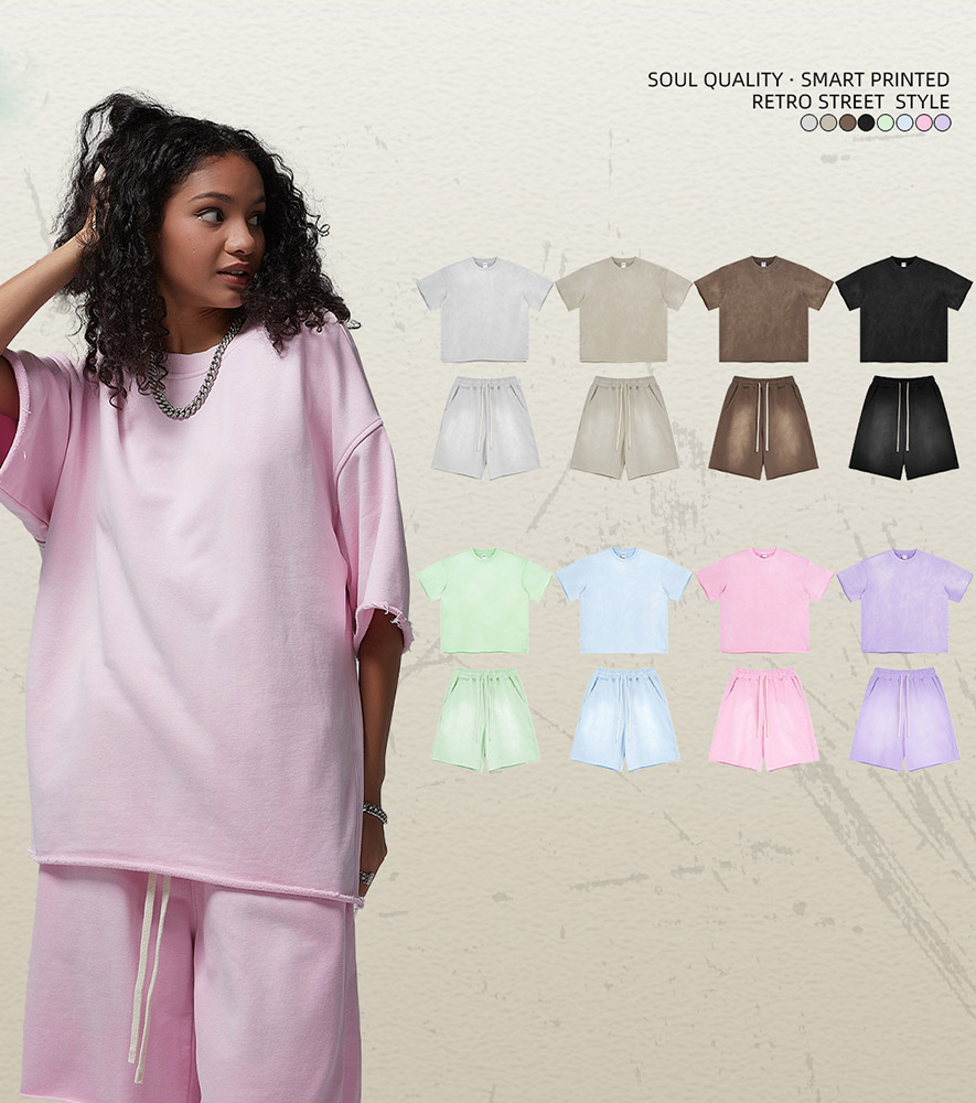
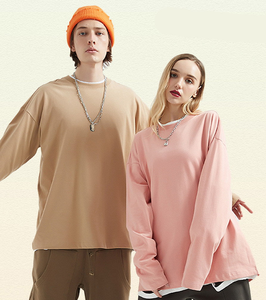
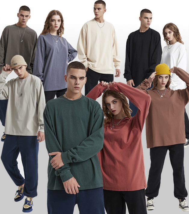
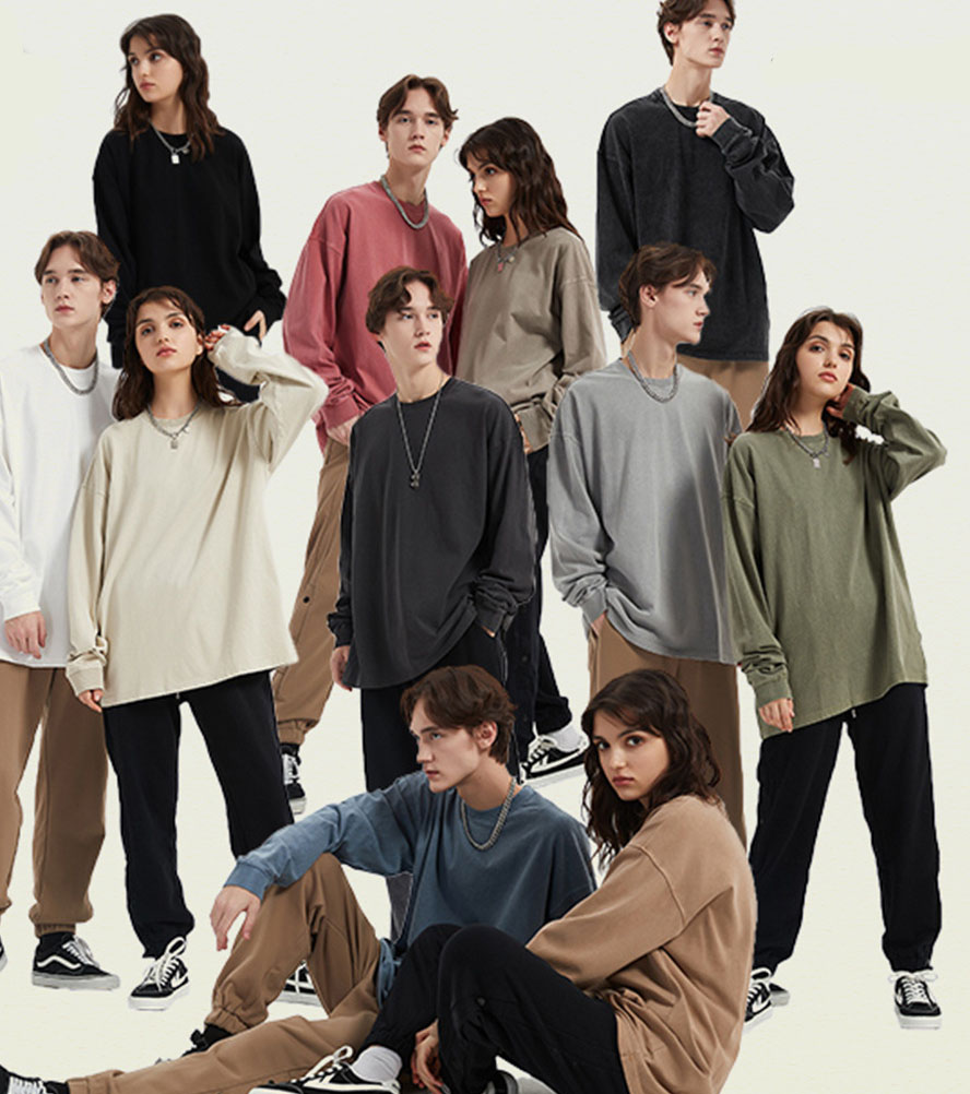
I see T-shirt silhouettes come in many forms. Oversize looks, slim cuts, cropped lengths—each style demands a different approach. For instance, large rubber stamps pop on bigger canvases. Embroidery can appear subtle on fitted tops.
Oversize T-shirts pair well with bold graphics or raised effects. Slim short tees can look sleek with small embroidery or well-placed patches. Understanding how these crafts scale on each silhouette helps unify form and design.

Oversize T-shirts are more suitable for large-scale printing or three-dimensional rubber stamps? Why?
Oversize T-shirts offer a bigger “canvas.” Large prints look balanced on this wide surface. Three-dimensional rubber stamps add visual interest, especially if placed on the chest or back. These raised designs fill the extra space and create texture, making the tee feel bold and modern.
Will slim short T-shirts with embroidery and patches1 look cumbersome?
I think it depends on size and placement. Smaller, more delicate embroidery or patches can add flair without overwhelming. Subtle motifs on the chest or sleeve can accentuate a fitted silhouette. Avoid oversized patches in large clusters. The key is a refined balance that highlights the T-shirt’s sleek form.
Analysis of the style differences and visual presentation of printing, embroidery, patches, and rubber stamps?
I find that each technique offers a distinct look. Printing can be bold or minimal. Embroidery feels tactile. Rubber stamps are raised and edgy. Patches channel a playful or retro vibe. Recognizing these differences helps match the method to your target style.
Printing can lean trendy with pop designs or minimalist with monochromatic graphics. Embroidery and patches often bring depth and a handcrafted feel. Rubber stamps deliver a modern, three-dimensional finish that can suit streetwear or futuristic themes.

Is printing more suitable for trendy style or minimalist style? What are the pattern matching suggestions?
Printing works in both styles. For a trendy look, I use bright, contrasting colors or large type. For a minimalist vibe, I pick simple line art or low-key typography. Avoid clutter. Focus on a single motif or a limited palette. That way, the tee looks clean and intentional.
What kind of layering and texture are suitable for embroidery and patches?
I see embroidery as rich and tactile. Layer it on thicker fabrics, so the stitches hold shape. Patches can add even more dimension if they’re sewn or appliquéd with contrasting edges. Combining small patches can create a collage effect. This layering feels playful and eye-catching.
How to determine the appropriate T-shirt craftsmanship based on fabric selection?
I learned that not all fabrics handle every technique well. Cotton is versatile, but cotton-ammonia blends stretch more. Functional fabrics may resist certain inks or thread tensions. Matching the right technique to the right material prevents issues like peeling or puckering.
Heavier cotton often supports larger prints or 3D rubber stamps. Stretchy blends require careful placement of embroidery or patches to avoid distortion. Functional fabrics may need specialized inks or heat-press methods. Balancing craft and textile is critical for durability and appearance.
What are the precautions for cotton, cotton-ammonia, and functional fabrics in craft matching?
- Cotton: Absorbs ink well but can shrink if not pre-treated.
- Cotton-ammonia: More elastic. Large prints could crack if stretched often. Embroidery threads need to accommodate stretch.
- Functional fabrics: Often moisture-wicking or synthetic. Must use inks or adhesives that bond properly and do not degrade performance.
Will printing and rubber stamps2 affect the breathability or extensibility of the fabric?
Sometimes. Heavy rubber stamps can reduce airflow slightly. Large solid prints may limit fabric stretch if they cover big areas. That is why strategic placement or partial coverage is important. Using breathable inks and careful stamping methods can help maintain comfort.

Positioning printing vs overall pattern, how to match the proportion of the version to be more coordinated?
I used to wonder whether it’s better to print across the entire T-shirt or position smaller graphics. It depends on the cut and the desired impact. Larger prints can be striking, but they might clash with curved seams. Smaller, strategically placed prints can look more polished.
Position-based printing allows me to create focal points, like on the chest or back. Overall patterns can be vibrant if well-aligned with the garment’s shape. Balancing coverage and placement ensures the final look feels harmonious rather than random.
How to determine whether the print is more suitable on the chest, back or side?
I often check the T-shirt style and target audience. Chest prints are classic and visible. Back prints can surprise or make a statement. Side placements can complement minimal front designs. Think about proportions. A smaller T-shirt may only need one focal point to avoid clutter.
How to flexibly apply small and large patterns according to the style and preferences of the crowd?
I like to gauge the brand identity. Younger streetwear fans may enjoy large, eye-catching prints. A more mature market might prefer subtle or smaller placements. Offer multiple options. For instance, one design can appear in a bigger format on oversize tees and in a smaller format on slim-fit styles.
Conclusion
In my view, mixing printing, embroidery, rubber stamps, and patches starts with understanding your T-shirt silhouette, fabric, and audience. Each craft brings a unique visual and textural element. By matching the right technique to the right style, you can create a refined, high-end look. I believe thoughtful placement and balanced proportions ensure each piece stands out in the best way possible.