
 Skip to content
 Graphic execution changes how a sweatshirt looks, feels, and ages. In graphic sweatshirts, the method is not a finishing detail added after design.
It is part of the garment’s material logic.
This matters because the same artwork can produce very different results depending on whether it is printed, embroidered, or built through a hybrid method. A strong graphic sweatshirt is defined not only by visual idea, but by how that idea is physically applied to the fabric.
Graphic application methods fall into two main systems: print-based graphics and stitch-based graphics. These systems create different surfaces, different tactile effects, and different aging patterns.
Before judging quality, it is necessary to understand what each method is actually doing to the sweatshirt.
Printed graphics are surface-applied visuals that place ink or transfer material onto the face of the sweatshirt.
The design sits on top of the fabric rather than being built through the fabric structure itself.
This makes printing especially useful for logos, typography, illustrations, and larger graphic areas that require clean visual coverage. The strength of print is image clarity and design flexibility.
The limitation is that the graphic depends heavily on adhesion, ink quality, and fabric compatibility. A printed sweatshirt should therefore be judged by whether the graphic feels integrated rather than merely attached. If the print looks visually clear but feels unstable or overly coated, the execution is weaker than the design may first suggest.


Embroidered graphics are stitched structural decorations that build the design through thread rather than surface ink.
This gives the sweatshirt a raised, tactile graphic area that feels more physically embedded into the garment.
Embroidery is often used for logos, lettering, symbols, and smaller visual elements where texture and durability of form matter more than large-scale image detail. Its main strength is dimensional presence.
Its main limitation is that thread has less freedom than print when handling very fine detail or broad filled areas. A good embroidered graphic should feel anchored and intentional without making the garment pucker, stiffen, or distort. The correct judgment is whether the stitching supports the sweatshirt’s structure instead of competing with it.
Graphic technique is a material decision because it changes not only the image, but also the sweatshirt’s surface behavior, flexibility, and long-term wear pattern.
A print affects the hand feel of the fabric. An embroidery treatment adds localized weight and tension.
A hybrid method can combine both strengths, but also both risks. This means technique should not be chosen only by what looks attractive in a digital mockup.
It should be chosen by how the garment is expected to feel, move, and age in real use. The correct judgment is whether the application method fits the graphic intent and the sweatshirt base at the same time. When method and material are misaligned, visual quality usually declines over time.
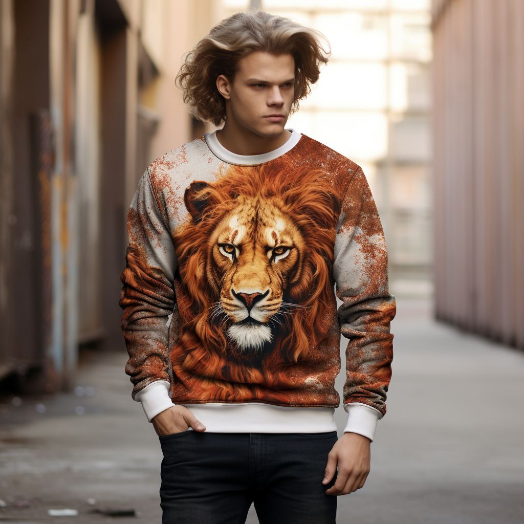
Most graphic sweatshirts rely on a small set of technical categories, even when the final results look very different. These categories include print-based methods, embroidery-based methods, and hybrid methods that combine both.
Understanding this technical map makes later judgments about quality and durability much clearer.
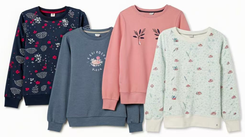
Screen printing and other print-based applications are the main visual reproduction methods used in graphic sweatshirts.
Screen printing is especially common for bold logos, text, and simple graphic fields because it creates strong coverage and clear edge definition.
Other print-based systems may support more detailed imagery or smaller production runs, but they still operate through surface application rather than stitching. The advantage of print-based methods is that they can reproduce broad graphic ideas with relative precision and scale.
The trade-off is that surface graphics depend on good ink behavior and proper bonding to remain stable over time. The correct judgment is whether the print looks clean, feels controlled, and suits the complexity of the artwork being used.
Direct embroidery and stitched logo treatments are the most common stitch-based methods in graphic sweatshirts.
These are typically used for smaller brand marks, chest logos, typographic details, and emblem-like motifs where depth and texture strengthen the garment’s visual identity.
The benefit of direct embroidery is that it creates a more dimensional and structurally anchored effect than flat printing. The limitation is that embroidery can become heavy, stiff, or visually crowded if used on overly complex artwork or across large areas.
A sweatshirt with direct embroidery should be judged by stitch cleanliness, edge accuracy, and panel stability around the design. If the embroidery looks raised but the fabric ripples or tightens underneath, the technique has been pushed too far or executed too weakly.
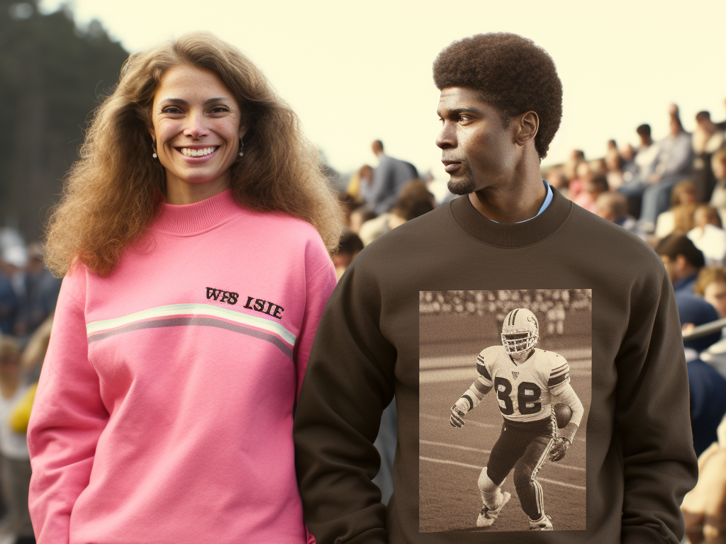
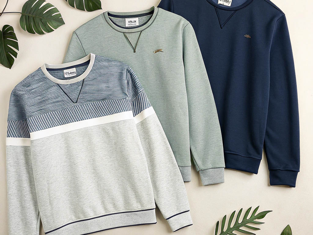
Hybrid methods combine print and stitch to create more layered graphic results.
A sweatshirt may use printed artwork as the main image and add embroidery for logos, outlines, or selected detail areas.
This approach can create stronger visual hierarchy because one method handles image clarity while the other adds tactile focus. The benefit is depth and contrast between surfaces.
The risk is imbalance. If the print and embroidery do not share the same design logic, the sweatshirt can begin to feel overworked rather than refined. The correct judgment is whether the methods support one another in a clear system. A strong hybrid sweatshirt should feel visually coordinated, not like two unrelated techniques forced into the same garment.
Printed and embroidered graphics differ in more than appearance alone. They create different levels of texture, different visual emphasis, and different physical relationships with the sweatshirt surface.
The choice between them should be understood as a difference in material behavior, not just style preference.
Printed graphics create surface flatness, while embroidery creates raised texture.
This is the most immediate physical difference between the two methods.
A print usually sits relatively close to the garment plane, even when the ink layer is noticeable. Embroidery lifts the design away from the surface, which makes the graphic more tactile and materially present.
This difference changes how the garment is read. Flat graphics usually emphasize image and clarity first. Raised graphics emphasize texture and structure first. The correct judgment is whether the chosen surface quality matches the design goal. A graphic meant to feel crisp and broad often suits print better, while a graphic meant to feel concentrated and dimensional often benefits from embroidery.

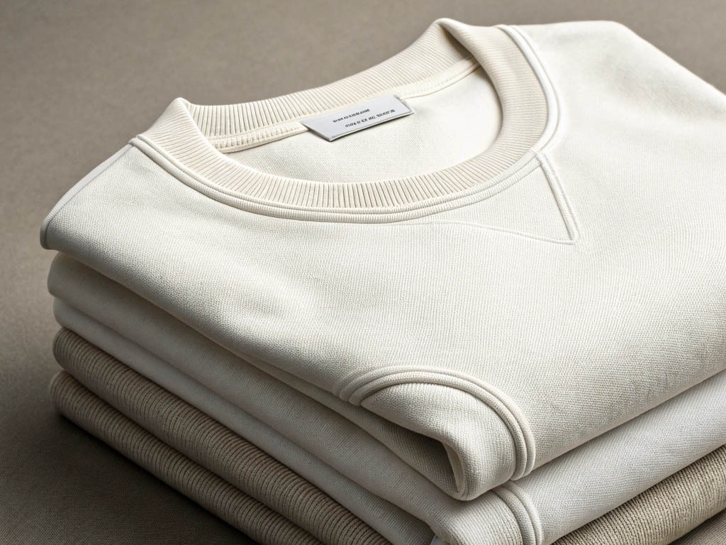
Printed graphics usually deliver more visual sharpness, while embroidery usually delivers more tactile depth.
This makes print stronger for gradients, detailed illustrations, fine lines, or larger graphic zones that need visual precision.
Embroidery, by contrast, is stronger when the design benefits from thread texture, contour, and a sense of physical layering. Neither quality is inherently superior.
The distinction lies in what the graphic needs to communicate. The correct judgment is whether the method supports the most important characteristic of the design. If clarity matters more than touch, print often performs better. If depth and structure matter more than detail, embroidery usually provides stronger presence.
Embroidery feels structural because it is built through thread tension and physical stitching, while print feels graphic-led because it prioritizes image on the fabric surface.
This creates a difference in how the viewer experiences the garment.
Embroidery often feels more like part of the construction, especially in logos or emblem areas. Print often feels more like visual content carried by the sweatshirt.
This difference matters in perception of quality as well as design tone. The correct judgment is whether the garment needs material presence or visual image dominance. Some sweatshirts benefit from embroidery because they need tactile identity. Others benefit from print because the graphic concept depends on surface communication more than stitched form.
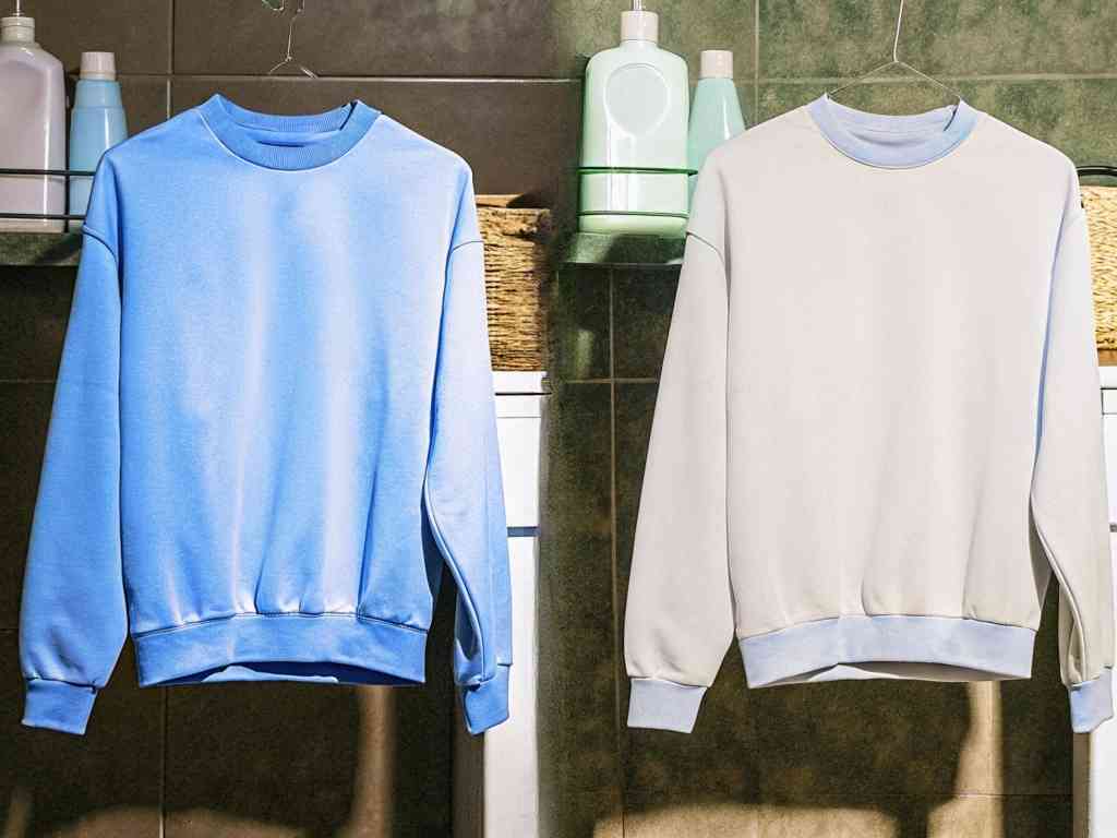
Graphic technique changes the hand feel of the sweatshirt and the way quality is perceived at first touch. This matters because users often judge sweatshirts not only visually, but through texture, softness, and material confidence.
A technique that looks good but feels wrong can weaken the entire garment impression.
Printed graphics can create either a soft hand or a coated surface feel depending on the method, ink load, and fabric compatibility. A better print usually feels controlled and integrated, allowing the sweatshirt to remain reasonably soft and flexible.
A weaker print often creates a plasticky or heavily coated surface that feels separate from the fabric itself. This distinction matters because a graphic sweatshirt should not lose all comfort in the name of visual impact.
The correct judgment is whether the print area still behaves like part of the garment. If the surface feels too rigid, rubbery, or detached, the method may have compromised daily wear quality even if the design looks visually sharp.
Embroidery changes hand feel through stitch density and localized texture. Dense stitching creates more tactile presence, which can make the graphic feel premium and physically defined.
But increased density also adds stiffness, weight, and potential strain to the base fabric. This is why embroidery quality is not measured by thickness alone.
A well-executed embroidered graphic should feel substantial without becoming rigid or overbuilt. The correct judgment is whether the stitching creates useful texture without pulling the sweatshirt out of balance. If the embroidery feels rich but the surrounding fabric begins to tighten or buckle, the tactile gain has come at too high a structural cost.
Technique affects perceived premium quality because users often interpret clean texture, stable execution, and material coherence as signs of better construction. A print that feels smooth, balanced, and well integrated will usually read as more refined than one that feels cheap or overly synthetic.
An embroidery that feels controlled and structurally calm will usually read as more premium than one that looks bulky or messy. The correct judgment is not whether one technique is always more expensive-looking.
It is whether the chosen technique feels appropriate, disciplined, and well resolved on that specific sweatshirt. Premium perception comes from controlled execution, not from the method label alone.
Graphic techniques age differently because they fail in different ways. Some methods are more vulnerable at the surface. Others are more vulnerable through tension, thread wear, or stiffness.
Long-term performance should therefore be judged by how the graphic changes over repeated wear, not by how impressive it looks when new.
Print durability depends on adhesion, flexibility, and resistance to cracking, fading, or peeling. A well-made print should remain visually stable through repeated washing and daily movement without losing major clarity too early.
Surface aging can be normal, but early fracture lines, fast fading, or edge lifting usually indicate weak execution or poor material compatibility. The correct judgment is whether the print changes gradually and evenly instead of breaking down in a sudden or patchy way.
A durable printed sweatshirt should preserve readability and surface stability over time. If the graphic becomes brittle, washed out, or detached too quickly, the technique has not supported real long-term use.
Embroidery usually resists surface fading better than print, but it carries its own durability risks. Thread can fray, snag, or loosen under repeated friction, and dense embroidery can place stress on the base fabric if tension is not balanced well.
This means embroidery is durable in a different way rather than in a universally better way. It often preserves visual structure well, but may challenge the garment through localized stiffness or panel distortion.
The correct judgment is whether the embroidery remains tight, clean, and structurally calm after repeated use. A durable embroidered sweatshirt should age through light softening, not through thread failure or visible puckering around the graphic zone.
Technique choice changes aging behavior because each method places different physical demands on the sweatshirt. Prints age through surface wear, cracking, fading, or edge breakdown. Embroidery ages through thread stress, friction response, and interaction with fabric movement.
Hybrid methods combine these patterns and can age unevenly if not carefully balanced. The correct judgment is whether the method chosen matches the graphic’s likely wear conditions.
A sweatshirt meant for frequent casual use should not rely on a technique that looks good initially but ages poorly under routine movement and washing. Long-term quality is method-specific, not generic.
Printed graphics depend heavily on ink quality because ink is not only the visual medium. It is also the functional layer that determines flexibility, adhesion, and resistance to breakdown.
A good print method can still fail quickly if the ink itself is weak or poorly matched to the sweatshirt fabric.
Ink quality matters first through adhesion and flexibility. Good ink must bond well enough to remain attached to the sweatshirt, but also move with the fabric instead of resisting it.
If adhesion is weak, the print may lift or peel. If flexibility is poor, the print may crack when the sweatshirt bends across the chest, shoulders, or sleeves.
The correct judgment is whether the printed area feels stable without becoming hard. A strong printed sweatshirt should allow the graphic to hold shape without turning into a brittle surface. Cracking resistance is usually one of the clearest signs that ink quality and garment behavior are aligned.
Low-grade inks fade or break down faster because they usually have weaker pigment stability, weaker bonding behavior, or lower tolerance for washing and repeated movement. These inks may look acceptable at purchase, but often lose density, surface integrity, or color balance too early.
This is especially visible in dark graphics, bold logos, or prints with large filled areas, where fading and breakdown are easier to notice. The correct judgment is whether the print keeps enough contrast and surface control after routine wear.
If the graphic becomes dull, powdery, or broken too quickly, the ink system is likely one of the main weaknesses.
Surface feel can be misleading because a print that feels soft at first is not always the most stable, and a print that feels slightly more substantial is not always lower quality. The key is balance.
Good printed graphics should feel integrated, flexible, and durable at the same time. A print that feels extremely soft but fades quickly may have sacrificed too much stability. A print that feels thick and durable but cracks early may have sacrificed too much flexibility.
The correct judgment is whether the print’s hand feel predicts long-term performance rather than simply pleasing first touch. Stability matters more than immediate softness alone.
Graphic quality depends not only on the application method, but also on the sweatshirt’s construction. A stable graphic needs a stable base.
When the fabric stretches too much, twists too easily, or lacks consistent support under the graphic area, both print and embroidery become more vulnerable to distortion.
Fabric stability and knit density are important because graphics depend on a reliable surface. A denser, more controlled knit usually supports better print adhesion and better embroidery stability than a loose or unstable knit.
This is especially important in the chest and back, where large graphics often appear. The correct judgment is whether the fabric under the design remains visually calm and physically supportive.
A strong graphic cannot maintain long-term quality on a weak base. Stable fabric gives both print and embroidery a better chance of preserving clarity, shape, and wear performance over time.
Stretching and panel movement distort graphics because the graphic zone is forced to follow the garment’s instability. A printed design may crack, skew, or wrinkle when the panel stretches beyond what the surface layer can tolerate.
An embroidered design may tighten, pucker, or begin pulling the fabric unevenly when movement repeatedly stresses the stitched area. The correct judgment is whether the sweatshirt’s structure allows the graphic area to remain controlled during normal wear.
If the fabric panel is too unstable, even a good technique will often look worse after repeated use. Distortion is usually a system failure, not just a surface failure.
The structural conditions that protect graphics include stable panel construction, balanced knit density, and enough fabric support to prevent excessive movement or localized strain. A sweatshirt with these qualities helps graphics stay flatter, clearer, and more proportionate through washing and wear.
This applies to both print and embroidery, even though they fail differently. The correct judgment is whether the garment is built to support the graphic as part of its total construction.
A strong technique placed on a weak sweatshirt will usually age worse than a good technique placed on a structurally calm garment.
No graphic method is best in every category. Each method solves some problems while creating others.
This is why technique choice should be treated as a trade-off decision based on visual intent, tactile goals, and expected wear demand rather than as a simple ranking exercise.
Print is generally stronger for clarity, broad image coverage, and larger graphic scale. Embroidery is generally stronger for texture, tactile emphasis, and smaller structured motifs.
This means the better method depends on what the graphic is trying to achieve. A complex illustration usually benefits from print. A compact chest logo often benefits from embroidery.
The correct judgment is whether the method reinforces the design’s strongest quality. If the method fights the design, the result will usually feel compromised even when the execution is technically acceptable.
Different methods balance durability and flexibility in different ways. Prints can remain flexible and visually sharp, but may be more exposed to cracking, fading, or peeling if the surface layer is weak.
Embroidery can remain visually stable and resistant to color loss, but may reduce flexibility or create tension in the panel. The correct judgment is whether the method’s durability pattern fits the sweatshirt’s intended use.
A daily-use sweatshirt needs a technique that can survive repetition without either surface failure or structural stress becoming dominant.
The right graphic method depends on both visual intent and wear demand because a sweatshirt is judged by how it looks and how it behaves. A design meant for subtle texture and small-scale identity may justify embroidery. A design meant for broad visual communication may justify print.
A sweatshirt expected to be worn frequently in casual rotation may need a different balance than one meant for occasional statement use. The correct judgment is not which method sounds better in theory.
It is which method fits the design’s purpose, the garment’s structure, and the actual wear conditions it will face.
Graphic sweatshirts often age poorly because the method, materials, or garment base were not aligned correctly. These failures usually appear in predictable patterns, and learning to identify them makes quality judgment easier.
Good technique is often visible through the absence of early breakdown.
Poor print applications often fail through cracking, peeling, and fading because the surface system cannot tolerate repeated stress. Cracking shows weak flexibility. Peeling shows weak adhesion. Fading shows weak pigment or poor wash resistance.
These problems are especially visible in larger printed areas and high-contrast graphics. The correct judgment is whether the print remains readable and attached after normal use.
If these signs appear early, the sweatshirt is not aging well at the technique level, even if the graphic looked strong when new.
Weak embroidery often fails through thread pull, excessive stiffness, or puckering around the stitched zone. Thread pull suggests poor stitch control or weak finishing. Stiffness suggests too much density for the garment area. Puckering suggests tension imbalance between the thread system and the sweatshirt fabric.
These problems can make the graphic feel more structural than intended in a negative way. The correct judgment is whether the embroidery remains clean, stable, and smooth against the surrounding fabric.
If the stitched area disrupts the sweatshirt’s shape, the execution is weaker than it appears at first glance.
Unstable base fabrics accelerate graphic failure because they transfer more movement, more distortion, and more strain into the graphic zone. A weak panel can make a decent print crack faster and can make embroidery pucker sooner.
This means the garment base is not neutral in graphic quality. It is an active part of the outcome. The correct judgment is whether the sweatshirt fabric is stable enough to carry the chosen graphic method over time.
If the base is weak, even a respectable technique may age poorly because the structure underneath cannot support it.
Graphic technique quality is easier to judge when reviewed through a clear sequence. Visual texture, likely aging behavior, and compatibility with the sweatshirt base all need to be considered together.
A strong graphic sweatshirt usually shows coherence across all three areas rather than excelling in only one.
1.Visual clarity and texture check
2.Durability and aging-risk check
3.Fabric-construction compatibility check
We’ll get back to you within 24 hours. Attach your logo/design if needed.
💡 1 . Share your logo, fabric, and quantity for T-shirts, hoodies, and more.
📐 2. We’ll prepare samples for your approval.
🚚 3. Bulk production starts after deposit.
✅ We value your privacy. Your information is 100% safe and confidential.
📦 Need help? Chat with us via WhatsApp anytime!

Note: Your email information will be kept strictly confidential.
Note: Your email information will be kept strictly confidential.
Request a quote, discuss MOQ, lead time, fabrics & QC.
Visit our brand store: Modaknitswear

Retail orders (and dropshipping options) are available on Modaknitswear.