
 Skip to content
 Graphic sweatshirts are judged through both comfort and appearance. Unlike plain sweatshirts, they do not only need to feel easy on the body. They also need to hold the graphic in a way that looks intentional, readable, and appropriate for everyday streetwear.
That is why fit matters more than simple softness or looseness. A strong graphic sweatshirt should support movement, maintain graphic clarity, and create a silhouette that feels relaxed without becoming careless.
Fit matters more in graphic sweatshirts because the garment is doing two jobs at once. It must support the body comfortably, and it must also present the graphic clearly.
This means a fit problem is never only a comfort problem. It is also a visual problem.
Graphics change how fit is perceived because they make the front, back, or sleeves more visually active.
On a plain sweatshirt, small fit issues may go unnoticed. On a graphic sweatshirt, those same issues become easier to see because the design draws attention to shape, tension, and proportion.
A chest graphic can make tightness more obvious. A large back print can make length imbalance easier to notice. Even shoulder drop can look more extreme once the sweatshirt carries strong visual content.
The correct judgment is whether the fit allows the graphic to sit naturally on the body. A graphic sweatshirt is never judged by silhouette alone. The design changes how that silhouette is read.


Poor fit weakens both comfort and visual impact because the sweatshirt starts failing in two directions at the same time.
If the fit is too tight, the garment restricts movement and distorts the graphic. If it is too loose in the wrong way, the silhouette loses control and the design can look unfocused or visually disconnected.
This matters because the graphic is part of the garment’s identity. Once the fit disrupts the design, the sweatshirt loses some of its purpose even if the artwork itself is strong.
The correct judgment is whether the fit protects both wearability and graphic presentation. A graphic sweatshirt should not force a choice between feeling good and looking resolved.
Fit acts as the bridge between street-style presence and daily usability because it determines how the sweatshirt occupies space on the body.
Streetwear usually asks for more visual confidence than plain basics, but that confidence still has to work in ordinary life.
A good graphic sweatshirt fit should feel relaxed enough for daily movement while still giving the garment enough shape to carry its visual identity. That balance is what keeps the piece street-ready without making it impractical.
The correct judgment is whether the sweatshirt feels expressive without becoming exhausting. Good fit makes the garment usable in real life while still preserving the visual confidence expected in modern streetwear.

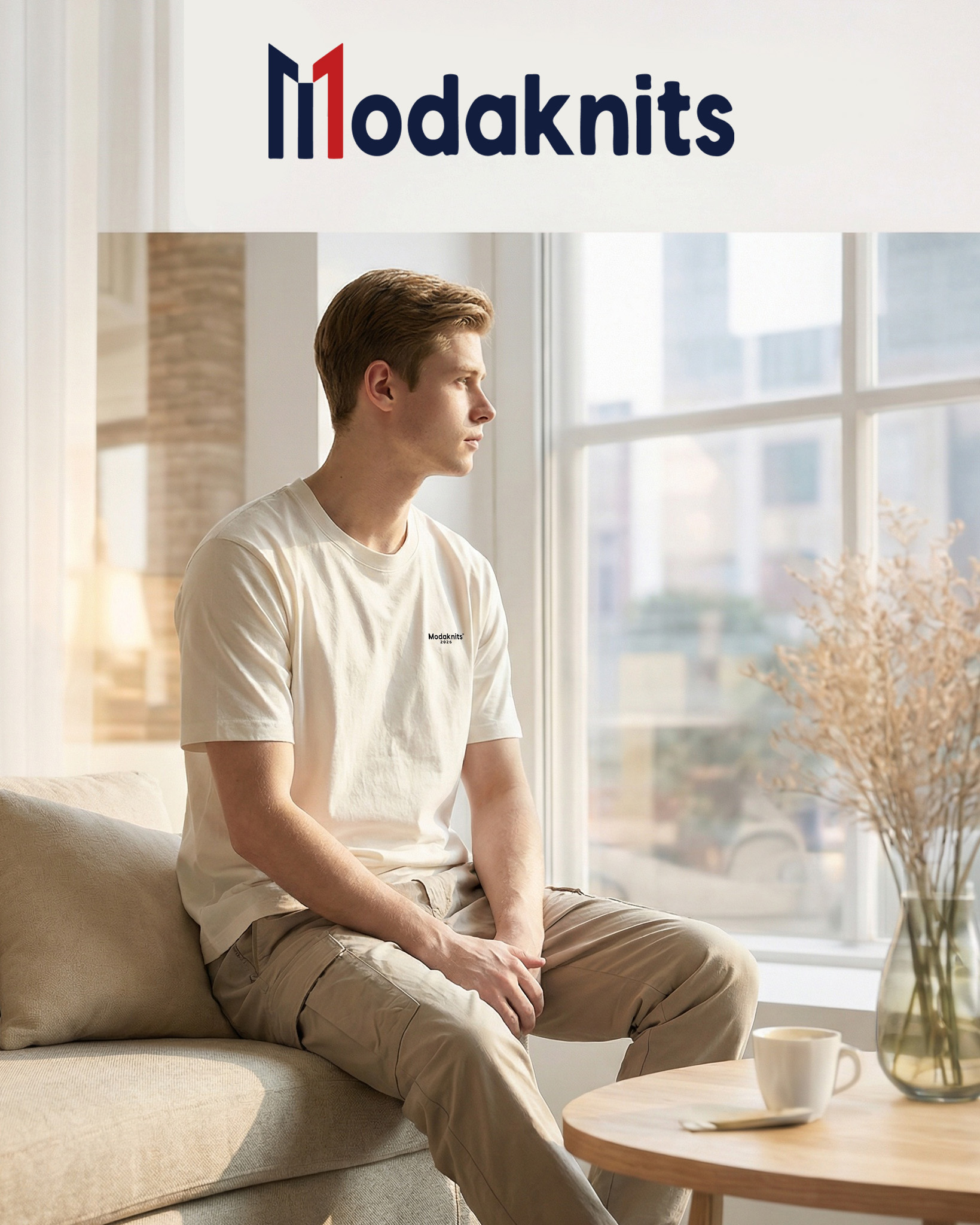
A graphic sweatshirt should fit with clear upper-body balance, controlled room through the torso, and enough volume to feel relaxed without looking oversized by accident. It should feel intentional, not accidental.
That means the sweatshirt should create ease while still holding a readable shape.

Shoulder placement is the first major fit checkpoint because it determines how the sweatshirt begins on the body.
In most well-balanced graphic sweatshirts, the shoulders should sit at the natural edge or drop slightly beyond it if the garment is meant to feel more relaxed.
If the shoulder line is too narrow, the sweatshirt often feels restrictive and makes the graphic area look tense. If it drops too far without enough design logic, the garment may look collapsed or poorly sized.
The correct judgment is whether the shoulder position supports the intended silhouette. A balanced upper body gives the graphic a stable frame and makes the sweatshirt feel more deliberate overall.
The chest and torso should feel relaxed, but not empty.
A graphic sweatshirt needs enough room for movement, layering, and comfort, yet too much body width can make the garment lose focus and reduce graphic authority.
This distinction matters because relaxed fit is not the same as uncontrolled volume. The front of the sweatshirt should feel easy without ballooning, and the body should hang in a way that keeps the design area stable.
The correct judgment is whether the sweatshirt provides ease while still preserving proportion. Good torso room supports both comfort and graphic clarity. Excessive room often weakens both.


Sleeve shape and body volume strongly influence whether the sweatshirt reads as streetwear or as ordinary casualwear.
Fuller sleeves, slightly relaxed body width, and a controlled amount of visual mass often help graphic sweatshirts feel more contemporary and more aligned with street-style dressing.
But these signals only work when the proportions stay coherent. If the sleeves become too long or the body becomes too oversized without control, the sweatshirt starts looking shapeless rather than expressive.
The correct judgment is whether the volume feels intentional. Strong streetwear fit usually comes from controlled ease, not from random excess.
Choosing the right size for a graphic sweatshirt is not only about how loose it feels. It is about whether the size preserves proportion, protects the graphic, and supports the intended silhouette.
That is why size selection should begin with balance rather than with a preference for “bigger.”
Graphic sweatshirts should not be sized only by looseness because extra space alone does not guarantee better style or better comfort.
A sweatshirt can feel large and still fit badly if the shoulders drop too far, the sleeves become awkward, or the graphic loses structure on the body.
This matters more in graphic garments because the design area reacts directly to poor sizing. Too much looseness can make the graphic look undersized, unstable, or visually disconnected.
The correct judgment is whether the sweatshirt keeps its intended shape while giving the body enough room. Size should support proportion first, not just width.


A pattern-designed relaxed fit is different from simply sizing up.
A sweatshirt designed to be relaxed usually adjusts shoulder drop, sleeve volume, chest room, and body length in a coordinated way. A basic sweatshirt sized up often increases dimensions unevenly.
That unevenness matters because it can make the garment longer, sloppier, or less balanced without actually improving the silhouette. In graphic sweatshirts, this can also change how the design sits and reads.
The correct judgment is whether the looseness feels built into the garment rather than added by guesswork. A true relaxed fit looks intentional. A random size-up often does not.
Graphic scale changes size perception because large graphics make the sweatshirt feel visually fuller, while smaller graphics may make the garment feel quieter or even larger by comparison.
This means the same physical fit can look different depending on how much graphic space is activated.
A large central print may make a relaxed sweatshirt feel more substantial and more present. A small chest graphic on the same sweatshirt may make the body volume feel more dominant.
The correct judgment is whether the graphic and the size work together. The garment should not feel visually over-expanded or underpowered because the design scale and fit scale are fighting each other.

Some fit profiles support graphics better than others. The best options usually allow the design to remain clear while preserving everyday wearability.
This is why regular-relaxed and controlled oversized fits often perform better than very slim ones.
Regular-relaxed fits usually work best for everyday graphic sweatshirts because they combine stability, comfort, and enough volume for the graphic to sit cleanly. This fit category tends to feel easy without making the garment too dependent on trend or exaggeration.
It also supports repeated use because it works across different casual settings and layers well with outerwear. The silhouette stays calm enough for daily wear while still offering some streetwear presence.
The correct judgment is whether the fit creates a balanced garment that feels natural both visually and physically. For many people, regular-relaxed is the strongest middle ground.
Oversized fits can strengthen graphic presence because they increase surface area and give the sweatshirt more visual weight. This often makes larger prints feel more natural and can create a stronger streetwear impression.
But oversized only works when it is intentional. The sweatshirt still needs proportion through the shoulders, sleeves, length, and body width. If the volume becomes too uncontrolled, the graphic may feel lost instead of amplified.
The correct judgment is whether the oversized fit strengthens the design without weakening the garment’s clarity. A strong oversized sweatshirt should still feel designed, not merely large.
Overly slim fits often weaken graphic sweatshirts because they make the garment feel too close to the body and reduce the graphic’s ability to sit naturally. Tight chest tension, narrow sleeves, and reduced torso ease can all make the design feel stretched or visually compressed.
This also reduces comfort, especially in garments meant for casual and repeated wear. A sweatshirt that is too slim often loses the relaxed confidence that makes graphic streetwear convincing in the first place.
The correct judgment is whether the fit leaves enough room for both movement and graphic stability. In most modern streetwear contexts, overly slim fits reduce rather than improve graphic sweatshirt performance.
A graphic sweatshirt should work while the body moves, not only when the wearer is standing still. Real comfort appears during commuting, sitting, walking, and ordinary daily motion.
This is why movement-based comfort is one of the most important fit tests.
Shoulder and arm mobility matter because sweatshirts are worn in active daily situations, not in static presentation alone. The garment should allow reaching, lifting, carrying, and normal upper-body movement without pulling hard across the chest or underarm.
This is especially important in graphic sweatshirts, where too much tension can also distort the design area. A garment that looks good while still but strains in motion is not well resolved.
The correct judgment is whether the sweatshirt supports ordinary upper-body movement without resistance. Good mobility helps both comfort and visual stability at once.
Body ease should remain consistent during commuting, sitting, and walking because a sweatshirt often stays on for long stretches across different body positions. The sweatshirt should not bunch too aggressively when seated, ride up too easily while walking, or feel restrictive in transit.
This matters because everyday comfort depends on transitions between movement and rest. A sweatshirt that works only in one posture is less useful than it first appears.
The correct judgment is whether the body of the sweatshirt remains calm and manageable across real daily use. Ease should feel reliable, not temporary.
Comfort must hold beyond first wear because many garments feel acceptable for a few minutes but become less usable over time. A graphic sweatshirt is usually intended for repeated, long-duration casual use, so it needs to remain easy after the novelty of first try-on fades.
This includes how the garment feels after walking, sitting, layering, and adjusting to temperature changes. Real comfort is tested over hours, not moments.
The correct judgment is whether the sweatshirt still feels natural later in the day. If comfort declines quickly, the fit is weaker than it first seemed.
All-day comfort depends on more than size alone. It includes weight, pressure, softness, and how often the sweatshirt asks the wearer to adjust it.
A good graphic sweatshirt should fade into the routine rather than become a burden inside it.
Pressure, weight, and body ease matter because long-hour wear changes how a sweatshirt is experienced. A garment that is too heavy may become tiring through the shoulders or torso. A garment that fits too closely may create pressure across the chest or sleeves. A garment that is too loose may feel visually and physically unstable.
The correct judgment is whether the sweatshirt feels supported rather than burdensome after extended use. Good all-day wear comes from balance, not from exaggerating either lightness or volume.
A sweatshirt should feel present enough to be useful, but not so demanding that the wearer becomes constantly aware of it.
Fabric contact and internal softness matter because the inside of the sweatshirt stays against the body for hours. Even a visually strong graphic sweatshirt becomes less useful if the interior feels rough, dry, or irritating during repeated wear.
Movement comfort also depends on how that inner surface behaves as the body shifts through the day. A sweatshirt should remain easy during walking, sitting, and layering, not only during stillness.
The correct judgment is whether the fabric supports all-day contact without becoming distracting. Comfort should remain stable, not disappear once the garment is actually used.
Good fit reduces adjustment because the sweatshirt naturally stays in the right place on the body. The wearer should not need to keep pulling the hem down, correcting the sleeves, or repositioning the graphic area.
This matters because repeated adjustment creates both physical and mental fatigue. A well-fitted sweatshirt makes daily wear easier by staying stable through ordinary motion.
The correct judgment is whether the garment allows the wearer to forget about it for long stretches. If frequent correction is needed, the fit is usually off even when the fabric itself feels comfortable.
Fit changes how graphics sit, how they move, and how clearly they can be read. This means the relationship between fit and graphic is direct, not secondary.
A sweatshirt may feel comfortable and still fail visually if the fit weakens the design.
Tight fit often distorts graphic presentation because the sweatshirt surface is stretched too close to the body. This can widen logos, curve text, and interrupt the intended proportions of the design.
The problem is especially visible in chest graphics and other central placements, where body tension directly affects readability. A graphic that should feel stable instead begins to look strained.
The correct judgment is whether the design remains proportionate in natural posture and ordinary movement. If the graphic changes shape too easily, the fit is too tight for the garment’s visual purpose.
A relaxed fit usually supports more stable graphic visibility because it gives the design a calmer surface to sit on. The fabric is less likely to pull hard across the body, and the graphic can stay more proportionate in motion.
This does not mean the garment should be oversized without control. It means the sweatshirt should create enough ease that the design remains legible and visually balanced through wear.
The correct judgment is whether the fit gives the graphic enough stability to be read naturally. Relaxation improves visibility only when the silhouette remains coherent.
Fit must protect graphic clarity because the graphic is one of the main reasons the sweatshirt exists. A fit that feels physically acceptable but weakens the design still fails part of the garment’s function.
This is what makes graphic sweatshirts different from plain ones. The body and the artwork have to be supported together. The silhouette must help the design appear intentional, not interfere with it.
The correct judgment is whether the sweatshirt keeps the graphic readable while still supporting everyday comfort. Both conditions must be true at the same time.
Graphic sweatshirts often need to feel expressive enough for streetwear, but stable enough for ordinary life. That tension defines much of their appeal.
The strongest examples usually rely on controlled volume rather than extreme exaggeration.
Streetwear fit should create visual confidence without depending entirely on oversized volume. A graphic sweatshirt can feel strong through proportion, shoulder presence, sleeve shape, and graphic clarity without needing to become extremely large.
Excess volume often makes the garment feel less practical and may weaken the graphic by reducing focus. Confidence usually comes from controlled silhouette rather than from size alone.
The correct judgment is whether the sweatshirt has presence without becoming unwieldy. A street-ready fit should feel deliberate, not inflated.
Relaxed silhouettes work best when they support everyday routines rather than fighting them. The garment should layer well, move easily, and remain comfortable in transit, indoor use, and casual social settings.
This means the silhouette has to do more than look correct in a mirror. It has to function across ordinary activity. A good relaxed graphic sweatshirt should still feel practical after hours of wear.
The correct judgment is whether the garment stays useful once real life begins. Wearability is what gives streetwear fit long-term value.
Modern street-style often relies on controlled comfort because people want garments that feel expressive without becoming exhausting. The silhouette should signal intention, but it should also respect movement, comfort, and repeat use.
This is why many strong graphic sweatshirts avoid both extreme slimness and uncontrolled oversizing. They use moderate relaxation, stable graphic presentation, and enough volume to create identity without sacrificing function.
The correct judgment is whether the sweatshirt feels confident and usable at the same time. Controlled comfort is often what makes modern streetwear convincing.
Graphic sweatshirts often go wrong in predictable ways. These mistakes usually affect both the body experience and the visual effect of the garment.
Recognizing them makes it easier to judge quality before wearing or buying.
Oversizing becomes a problem when it weakens shape and causes the graphic to lose its visual position on the body. The sweatshirt may feel roomy, but it can also start looking collapsed, too long, or too wide without enough structure.
This affects the graphic because the design no longer feels anchored. Instead of gaining presence, it may begin to look smaller, less focused, or less intentional.
The correct judgment is whether the oversized effect still has proportion. If the sweatshirt feels big without looking designed, the fit has gone too far.
Tight fits reduce comfort and distort visuals because they pull the sweatshirt too close to the body. This limits movement, increases pressure in active areas, and changes how the graphic is seen.
Text may bend, logos may stretch, and the sweatshirt may lose the relaxed attitude expected in graphic streetwear. The garment becomes both less comfortable and less visually convincing.
The correct judgment is whether the sweatshirt leaves enough room for both body ease and stable graphic presentation. If not, the fit is too narrow for its purpose.
One of the most common mistakes is evaluating fit only by feel or only by appearance. Graphic sweatshirts require both. A garment may look visually strong but move poorly. Another may feel soft and easy but weaken the graphic completely.
This split judgment leads to poor choices because the sweatshirt is meant to function as one system. The body, the silhouette, and the graphic all need to align.
The correct judgment is whether the garment works in motion and still presents the design well. Ignoring either side usually produces a weaker result.
A strong graphic sweatshirt fit can be judged through a simple sequence. First check upper-body balance. Then check movement and long-hour comfort. Finally check whether the graphic still reads clearly inside the silhouette.
This creates a more dependable standard than relying on first impression alone.
1.Shoulder, chest, and sleeve balance check
2.Movement and long-hour comfort check
3.Graphic clarity and streetwear silhouette check
We’ll get back to you within 24 hours. Attach your logo/design if needed.
💡 1 . Share your logo, fabric, and quantity for T-shirts, hoodies, and more.
📐 2. We’ll prepare samples for your approval.
🚚 3. Bulk production starts after deposit.
✅ We value your privacy. Your information is 100% safe and confidential.
📦 Need help? Chat with us via WhatsApp anytime!
Note: Your email information will be kept strictly confidential.
Note: Your email information will be kept strictly confidential.
Request a quote, discuss MOQ, lead time, fabrics & QC.
Visit our brand store: Modaknitswear
Retail orders (and dropshipping options) are available on Modaknitswear.