
 Skip to content
 A graphic hoodie looks balanced when placement, scale, and color work with the garment instead of competing against it. In modern streetwear, the graphic is not an added decoration alone. It is part of the hoodie’s structure, identity, and visual rhythm.
This page explains how to judge whether a graphic hoodie feels clear, controlled, and wearable. The goal is not to decide whether a design is loud or quiet in isolation. The goal is to understand whether its composition is intentional.
Graphic placement is the first design decision because it determines where the eye goes and how the hoodie is read.
Before color or message is noticed, placement establishes order.
A well-placed graphic gives the garment structure, while poor placement makes the design feel accidental or visually unstable.
Graphic placement determines the focal point of a hoodie before any other design element does.
The eye naturally looks first at the area with the strongest visual signal, so the graphic becomes the garment’s main point of attention. When that focal point is placed with intention, the hoodie feels organized and readable.
When it is placed without proportion or alignment, the garment can feel visually confused. A chest graphic usually creates immediate recognition. A back graphic creates delayed impact that appears as the wearer turns away.
A sleeve graphic works more as a supporting detail. To judge placement well, first identify where the design wants the eye to land. Then check whether that location feels stable, centered, and proportionate to the hoodie’s overall silhouette.


Placement controls visual hierarchy by deciding which part of the design speaks first and which parts support it.
A graphic hoodie works best when one area clearly leads and other elements remain secondary. If every placement area competes equally, the garment loses clarity.
A centered chest print usually creates direct hierarchy because it is immediately visible. A large back print can also lead, but only if front details stay restrained. Sleeve graphics usually work best when they extend the main idea rather than replace it.
Good hierarchy means the viewer can understand the design in one glance and notice supporting details in a second glance. A balanced hoodie does not ask the eye to solve too many visual questions at once.
Good graphic placement respects the physical structure of the hoodie rather than ignoring it.
A hoodie already has strong design lines: the hood opening, shoulder seams, kangaroo pocket, ribbed hem, cuffs, and sleeve shape. Graphics that work well are positioned in relation to those built-in lines.
For example, a chest graphic should sit with enough distance from the neckline and pocket area to avoid crowding. A back graphic should account for shoulder width and hood drape. Sleeve graphics should follow the sleeve’s length and movement.
When graphics are placed without regard for construction, the design can feel forced even if the artwork itself is strong. The best way to judge placement is to see whether the graphic and the garment appear designed together.

Most graphic hoodies rely on a few standard placement zones because these areas support visibility and structure.
Each zone creates a different kind of visual effect. Understanding these common placements makes it easier to judge whether a design uses the hoodie clearly or overuses it.
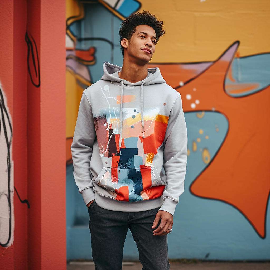
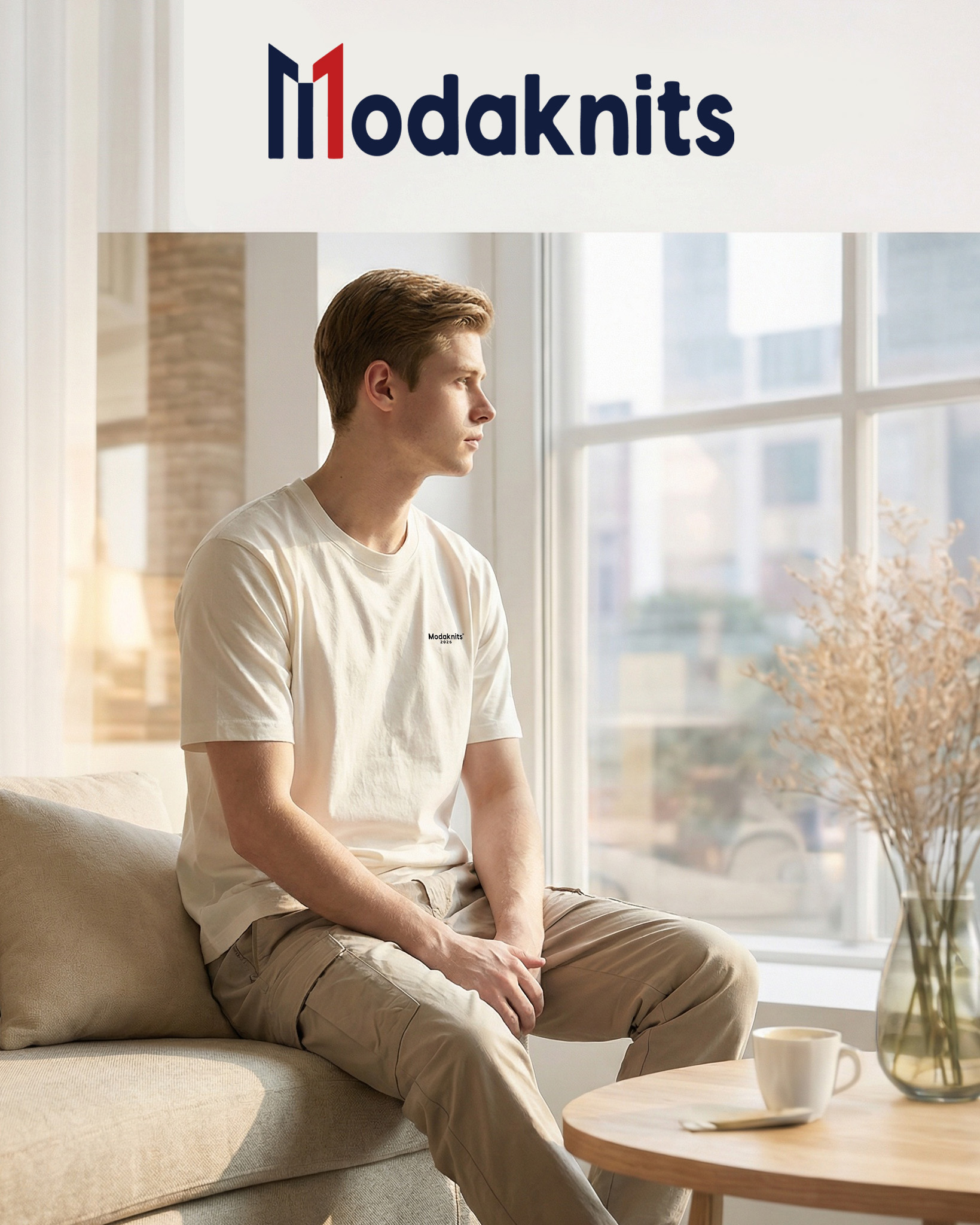
Chest graphics work as central visual anchors because they are the most immediate and readable placement on a hoodie.
This area is visible in direct conversation, everyday movement, and product display, so it often becomes the primary identity zone. A chest graphic can be small and restrained or medium in scale, but it usually performs best when its width fits the torso without reaching too close to the side seams.
Placement that sits too high can feel cramped near the neckline. Placement that sits too low can interfere with the pocket area and weaken visual tension.
A strong chest graphic creates a stable center. It gives the hoodie a clear front-facing identity without forcing the viewer to search for the design.
Back graphics create large-scale visual impact because the back panel offers the biggest uninterrupted surface on the hoodie.
This gives designers room for artwork, typography, or brand imagery that would feel too heavy on the front. Back placement often supports a stronger streetwear impression because it allows for larger graphics without overwhelming face-to-face interaction.
The design still needs control. If it rises too close to the hood or spreads too widely across the shoulders, it can feel crowded. If it drops too low, it can lose structure and feel disconnected from the upper body.
The best back graphics use the panel’s scale while preserving margin around the artwork. That breathing space is what makes large graphics feel intentional instead of oversized.


Sleeve graphics work best as secondary accents because sleeves are narrow, directional spaces rather than primary visual fields.
They are useful for adding movement, identity, or repetition without taking over the whole garment. Common sleeve graphics include text, symbols, stripes, or small icons placed along the outer arm.
The key judgment point is whether the sleeve detail supports the main design or distracts from it. Sleeve graphics become harder to control because fabric bends at the elbow and twists with movement. Designs that are too wide, too dense, or poorly aligned can distort quickly when worn.
Strong sleeve placement follows the arm’s natural line and keeps the message simple. In balanced hoodie design, sleeve graphics should enrich the garment, not become a second competing centerpiece.
Multi-location graphics can add depth, but they only work when each placement has a clear role.
A hoodie may use a small front mark, a large back graphic, and sleeve accents together. This structure can feel layered and complete if the visual hierarchy is controlled. It can also feel overloaded if every area uses similar weight, contrast, or complexity.
Good multi-location design separates functions. One graphic leads, one supports, and one adds detail. The viewer should understand the arrangement quickly without feeling pulled in several directions.
The judgment standard is simple: if removing one graphic improves clarity, the original composition was probably too busy. Layering is effective only when the placements feel coordinated rather than accumulated.
Graphic scale determines how strongly a hoodie announces itself and how easily it fits into regular wear.
Size changes perception even when the artwork stays the same.
A balanced hoodie uses scale in proportion to the garment, not only in proportion to the design file.
Small graphics create subtle visual identity because they signal design intent without dominating the garment.
This scale is often used for minimal logos, small symbols, or restrained text placed on the chest, sleeve, or upper back. A small graphic works well when the goal is recognition without constant visual pressure.
It also tends to be more versatile across daily settings because it leaves more of the hoodie’s fabric and silhouette visible. The main risk is insignificance. If the graphic is too small relative to the garment, it can feel like an afterthought rather than an integrated design choice.
The correct judgment is not whether a small graphic is quiet, but whether it still has enough presence to define the piece.

Medium graphics usually offer the best balance between identity and wearability.
They are visible enough to define the hoodie but controlled enough to stay easy to style in daily outfits. This scale often works well for front prints, moderate back graphics, or clean compositions with one clear message.
A medium graphic allows the garment to retain flexibility. It reads as intentional streetwear without forcing every outfit to revolve around the hoodie. This is often the most dependable scale for users who want graphic appeal with broader use across casual settings.
To judge medium scale well, look at how much untouched fabric remains around the design. That surrounding space is what keeps the graphic readable, stable, and wearable over time.
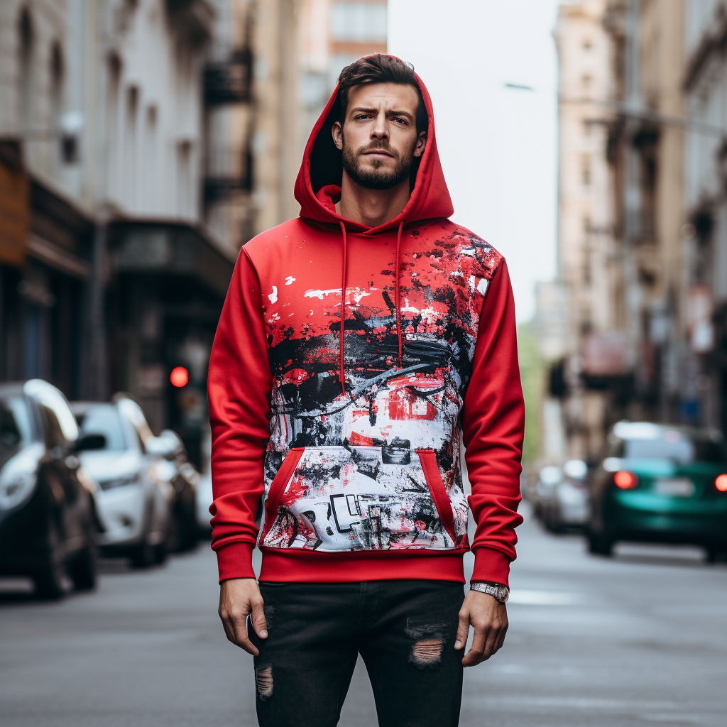
Large graphics create strong streetwear presence because they make the hoodie readable from distance and from motion.
This scale works when the garment is meant to carry a clear visual statement, especially on the back or across the upper torso.
Large graphics often feel culturally aligned with streetwear because the category values identity, symbolism, and public visibility. The risk is imbalance. When a large graphic fills too much of the panel, it can flatten the garment and remove visual breathing room.
Strong large-scale design still needs margin, placement discipline, and a simple enough composition to remain legible. A large graphic should feel deliberate and confident, not merely expanded to seem more expressive.

Bold graphics belong naturally to urban casualwear because streetwear has long used clothing as visible identity.
Strong graphics are not automatically excessive. They work when the rest of the garment gives them room and when the design language stays coherent.
Bold graphics work in streetwear because the category treats clothing as a visible form of identity rather than a neutral basic alone.
Streetwear often values recognition, symbolism, community reference, and visual self-definition. In that context, a hoodie is not just a warm layer. It is a surface that communicates affiliation, mood, taste, or cultural awareness.
This makes strong graphics more acceptable than in categories where understatement is the default. The judgment standard is not whether the graphic is noticeable. It is whether the visibility serves a clear identity function.
A bold graphic that expresses a coherent idea can feel natural in streetwear. A bold graphic with no visual logic usually feels loud for its own sake.
Bold graphics succeed when they function as cultural expression rather than decoration without meaning. In urban casualwear, a strong print can reference music, skate culture, visual art, typography, local identity, or brand language.
That expressive role gives boldness a reason. Without that reason, scale alone rarely creates value. The viewer should be able to sense intention, even if the message is not literal. Good bold design feels authored. It has a point of view.
To judge it well, ask whether the graphic communicates something beyond size. If the answer is yes, the design is often stronger. If the answer is no, the graphic may still be visible, but it is less likely to feel grounded or lasting.
Bold graphics stay wearable when the garment itself remains simple. This is one of the most important balance rules in hoodie design. If the artwork is visually strong, the base hoodie usually benefits from clean construction, limited color shifts, and restrained supporting details.
Too many added elements, such as multiple loud placements, contrast panels, or aggressive trims, can make the garment feel crowded. Simplicity in the hoodie body gives the graphic space to lead. This is why strong prints often work best on uncomplicated silhouettes and stable colors.
The correct judgment is to look at the whole garment, not just the artwork. Boldness becomes effective only when the surrounding design is calm enough to support it.
Everyday graphic hoodies usually work best when the design stays clean, legible, and structurally calm.
Wearability often depends less on whether a graphic exists and more on what kind of graphic it is.
Styles with visual discipline tend to remain easier to repeat in daily outfits.
Minimal logo graphics remain wearable because they create brand identity without overwhelming the hoodie.
A restrained logo can function as a subtle signal rather than the entire visual experience. This works well for users who want a graphic hoodie that still behaves like a regular wardrobe piece. The best minimal logos are proportionate, clearly placed, and not dependent on oversized scale to feel relevant.
Their strength comes from precision rather than volume. To judge them well, check whether the logo is integrated into the garment’s layout and whether it still feels intentional from normal viewing distance. A minimal logo should look deliberate and stable, not too faint to matter or too enlarged to remain minimal.
Clean typography graphics work for daily wear because words can create identity with less visual density than complex artwork.
Simple type, controlled spacing, and readable scale often make a hoodie feel modern and easy to style. Typography is especially effective when the message is short and the font choice fits the garment’s tone. The design becomes less wearable when the text is too long, too decorative, or stacked without enough spacing.
Good typography does not only say something. It also behaves as visual structure. The judgment points are clarity, restraint, and proportion.
If the text can be understood quickly and does not dominate the entire hoodie, it usually has stronger everyday value.
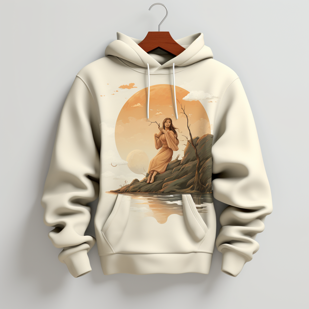
Simple illustrative graphics stay wearable because they add character without demanding too much visual attention. A single icon, line drawing, or restrained symbolic image can make a hoodie feel expressive while remaining easy to combine with everyday clothing.
The key is reduction. Illustrations that rely on too many colors, textures, or overlapping details often become harder to style and easier to tire of. Simpler artwork preserves readability and gives the garment more longevity.
To judge this style well, look at whether the illustration can still be understood at a glance. If the graphic needs close inspection to become clear, it may be visually richer but less versatile for regular use.
Color determines how loudly a graphic speaks and how clearly it is seen.
The same design can feel sharp, restrained, heavy, or quiet depending on contrast and palette.
Good graphic hoodie design uses color to support readability and balance, not only to attract attention.
High contrast increases graphic visibility because it creates a clear separation between the artwork and the hoodie base. Light graphics on dark fabric or dark graphics on light fabric are easier to read quickly and from farther away.
This makes high contrast useful when the design needs strong recognition or sharp visual impact. The trade-off is intensity. High contrast naturally feels more assertive, so it requires cleaner composition to avoid looking harsh or busy.
To judge it well, check whether the contrast improves clarity without overpowering the garment. Strong contrast should help the graphic speak clearly. It should not make the hoodie feel harder, louder, or more fragmented than the design requires.
Low contrast creates subtle design because the graphic and the garment base stay visually close in value or tone. This makes the artwork feel quieter and more integrated into the hoodie.
Low contrast works well for tonal branding, understated typography, and designs meant to reward closer attention rather than immediate visibility. The benefit is restraint. The risk is disappearance. If contrast becomes too weak, the graphic may lose function and stop defining the garment at all. Good low-contrast design still maintains enough distinction to be intentional.
The correct judgment is whether the graphic remains visible through form, finish, or slight tonal difference, even when it avoids strong visual separation.
Coordinated color creates balance because the graphic palette feels chosen in relation to the hoodie body rather than placed on top of it.
This does not require exact color matching. It requires relationship. A strong color system often uses one dominant base color and graphic colors that either support it quietly or contrast with purpose. Too many unrelated tones can break unity and make the hoodie feel visually unstable. Even bold graphics usually look better when the palette is limited and deliberate.
To judge coordination, look at whether the colors appear to belong to the same design logic. When graphic color and garment color feel connected, the hoodie appears more refined and easier to wear.
A graphic hoodie becomes cluttered when too many elements compete for attention at the same time.
Visual restraint is not about making every design minimal.
It is about preserving enough order that the garment remains readable. Good design knows where to stop.
Limiting graphic complexity keeps a hoodie readable because the eye can process the design quickly. Complexity becomes a problem when the artwork relies on too many layers, textures, symbols, or messages without a clear hierarchy.
A complex idea can still work, but it must be edited into a composition with one dominant visual path. The viewer should know what to notice first. If every detail asks for equal attention, the graphic loses force. Strong hoodie design often improves when unnecessary information is removed.
The question is not how much the designer can include. The question is how much the garment can carry without losing control. Simpler compositions usually age better and style more easily.
Too many graphic placements make a hoodie feel crowded because the garment stops having a clear front, back, or secondary zone. A design can use multiple placements effectively, but each one must justify its presence.
Problems begin when the chest, back, sleeves, and even hood all carry competing graphics with similar weight. The garment then feels less designed and more filled. Excessive placement reduces rest areas and weakens hierarchy. To judge this well, ask whether one placement could be removed without harming the design.
If the answer is yes, restraint would likely improve clarity. Good multi-placement design feels distributed with intention. Over-placement feels like visual accumulation rather than composition.
Visual breathing space is what allows a graphic to feel composed rather than compressed.
It refers to the untouched areas around the design that give it separation from seams, pockets, hems, and other graphics. This empty space is not wasted space. It is structural space. Without it, even a simple print can feel cramped. Breathing space becomes especially important with larger back graphics, typography blocks, and multi-location layouts.
The correct judgment is to look at margins around the artwork and at the amount of visible garment still allowed to exist as garment. A hoodie feels more refined when the design has room to sit clearly inside the silhouette.
Graphic hoodies stay relevant longer when their design decisions are governed by proportion, clarity, and restraint instead of novelty alone.
Timelessness does not mean plainness. It means the hoodie still reads well after visual trends change.
Balanced proportions and placement keep a graphic hoodie timeless because they make the design feel structurally correct before it feels fashionable.
When a graphic fits the hoodie’s scale, respects its construction, and sits in a stable visual position, the garment remains convincing even as trends shift. Poor proportion is one of the fastest ways for design to feel dated, because imbalance is easy to notice over time. A hoodie does not need to be conservative to be lasting. It needs to be composed.
The strongest long-term designs are often the ones where placement looks inevitable rather than experimental for its own sake. Structural balance gives visual ideas a longer life.
Clean graphic styles usually outlast trend-driven visuals because they depend on clarity more than novelty. Trends often rely on exaggerated effects, crowded references, distressed treatments, or overly specific aesthetics tied to a short cultural window.
Clean styles, by contrast, rely on legibility, order, and controlled expression. This does not mean every timeless hoodie must look minimal. It means the graphic should be understandable without depending on temporary visual codes. The best judgment standard is to imagine the design separated from current trend language.
If it still looks coherent, the graphic has a better chance of lasting. Strong design ages through structure, not through constant visual intensity.
Controlled color palettes help graphic hoodies remain timeless because they reduce visual noise and preserve design unity.
A limited palette allows the viewer to remember the composition as one system instead of many competing parts. This is true for both neutral and bold designs. A bold hoodie can still feel lasting if the color relationships are disciplined.
Problems often begin when too many tones are introduced without hierarchy or when trend-driven color effects overwhelm the graphic’s form. To judge palette control, check whether every color seems necessary and whether one or two dominant tones organize the rest. Timeless color use is usually less about playing safe and more about avoiding randomness.
A graphic hoodie can be judged systematically when placement, scale, color, and simplicity are reviewed in order. This avoids relying on taste alone.
Good evaluation begins with structure and ends with overall clarity.
1.Graphic placement clarity check
2.Scale and proportion check
3.Color balance check
4.Overall visual simplicity check
We’ll get back to you within 24 hours. Attach your logo/design if needed.
💡 1 . Share your logo, fabric, and quantity for T-shirts, hoodies, and more.
📐 2. We’ll prepare samples for your approval.
🚚 3. Bulk production starts after deposit.
✅ We value your privacy. Your information is 100% safe and confidential.
📦 Need help? Chat with us via WhatsApp anytime!
Note: Your email information will be kept strictly confidential.
Note: Your email information will be kept strictly confidential.
Request a quote, discuss MOQ, lead time, fabrics & QC.
Visit our brand store: Modaknitswear
Retail orders (and dropshipping options) are available on Modaknitswear.